


Apr 20 | 9 min read
Histogram evolution: visualize how a distribution of values changes over time
How to visualize a Prometheus histogram over time in Grafana
Preface: you want to see how your data is distributed
A simple statistical aggregate such as the geometric mean may hide valuable information and suggest a state that the observed system is never in. I usually make this point with a macabre example: on average, people have a little less than two legs. It's not factually the best example, but you might remember it!
Here is a different example from the computer system monitoring space. A mean HTTP request processing duration of 69 ms might look good. However, what if in reality no request ever took about 70 ms to be processed? What if — instead — about 98 % of all requests got processed within ~50 ms and the remaining 2 % ended up being processed an order of magnitude slower, within ~1000 ms? That would also explain a mean value of 69 ms, but with the additional information about the shape of the distribution and its two local maxima you would rightfully get curious about what was special about the small fraction of requests that were processed much slower than all other ones. A special code path? Maybe a slow machine doing the processing?
Oftentimes, we use the concept of percentiles to understand how the tail end of any distribution looks. But that still involves assumptions about the shape of the distribution — that it has one peak and otherwise a smooth tail.
When a distribution has local maxima, you should want to know about them. The easiest way to identify them is by looking at the distribution itself!
Visualization is key.
After looking at the distribution and sanity-checking its shape, you can still decide that a certain statistical aggregate derived from that distribution is good enough for your monitoring purposes (for example, for defining an alert based on a mean value threshold). Then you can justify the information loss implied by building aggregates such as the mean value or when doing percentile calculations.
The key takeaway here is to use aggregate values with confidence only after understanding or confirming the characteristics of the underlying distribution.
How to visualize the evolution of a distribution?
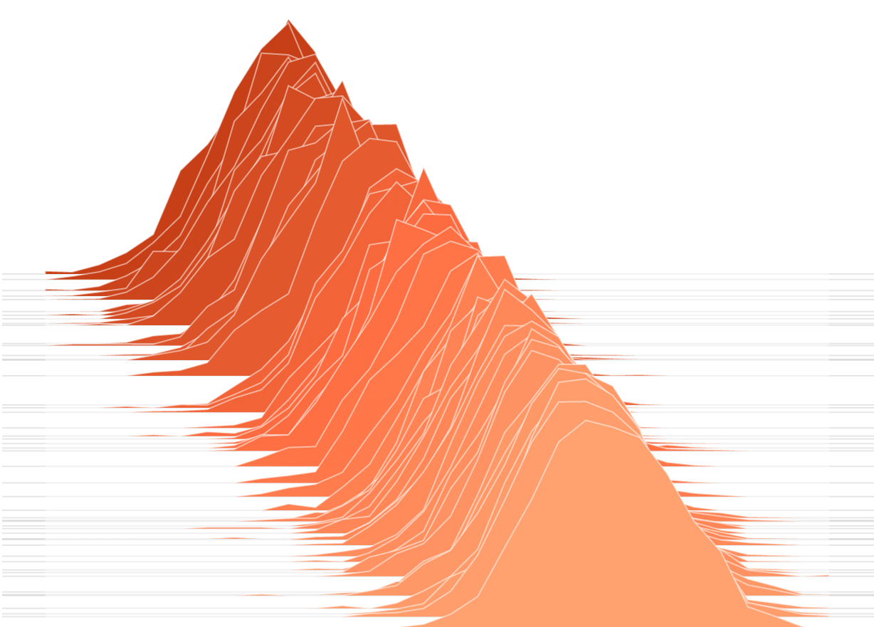
One of the most intuitive and practical ways to visualize a distribution of values is with a histogram. But what if the distribution of values we want to look at is expected to change over time, as it usually does in the field of system monitoring?
Enter the concept of visualizing the time evolution of a histogram.
That requires encoding three dimensions in a two-dimensional plot:
- time (usually from left to right on the "x-axis")
- the histogram bucket boundaries (usually from bottom to top on the "y-axis")
- the relative frequency with which individual values have occurred within a time slice and within a bucket: this can be color-coded
Think: the goal is to encode the height of the bars in the histogram using a color scheme.
Such a visualization can be done with Grafana. Let's get into how to do that.
Step-by-step guide: visualize Prometheus histogram evolution with Grafana
In this example walk-through, let's visualize the frequency distribution for how
long it takes to POST a certain HTTP request from an HTTP client's point of
view, including HTTP request retries. In this example, I have decided to name
the Prometheus metric of type Histogram duration_post_with_retry_seconds. That
is the <basename> of this metric, as documented at
https://prometheus.io/docs/concepts/metric_types/#histogram.
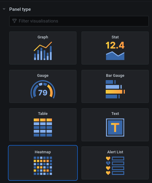
1) Create a new Heatmap panel

2) Construct the Prometheus query
This is the Prometheus query expression we're going to use:
sum by (le) (rate(duration_post_with_retry_seconds_bucket[30s]))
Woof, there's a lot to it! Let's take this slow. It's worth understanding every single bit of this.
We added the suffix _bucket. That is using a Prometheus naming convention to
get to the per-bucket time series data.
Each bucket in the histogram is described by a label called le. le is the
canonical abbreviation for "less than or equal". Therefore, the value of this
label encodes the upper inclusive bound for the corresponding histogram
bucket. This is important to know!
So, the sum by (le) in the query expression above means that we query for one
time series per bucket (all other metric label key/value pairs are summed over).
But, what's the deal with rate(...[30s])? What really does it mean?
In a normal, static histogram, the height of a specific bar usually means how
many times a certain event happened. In such a histogram, the bar height
therefore is a real, absolute count, indicating precisely that. For example:
values in the bucket/interval [1,2) were seen 30 times.
In our case here, you can think of us wanting to build a normal, static
histogram every N seconds. rate(...[30s]) effectively means: build a static
histogram over the course of 30 seconds, save the results, and then move on to
building the next histogram.
The resulting numbers encode an event rate (with the unit 1/s), averaged
over 30 seconds.
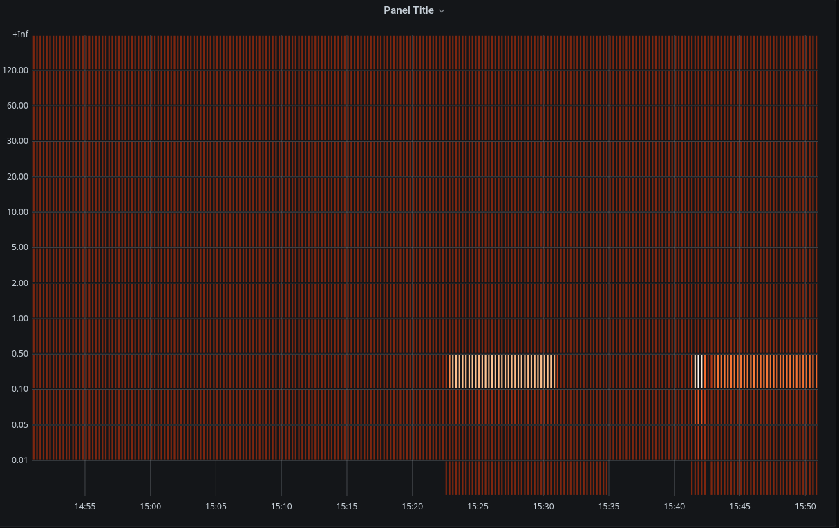
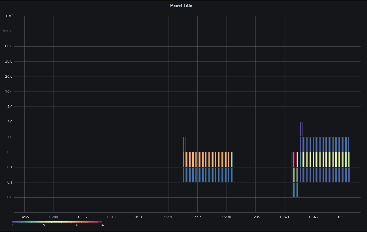
That's how things look now:

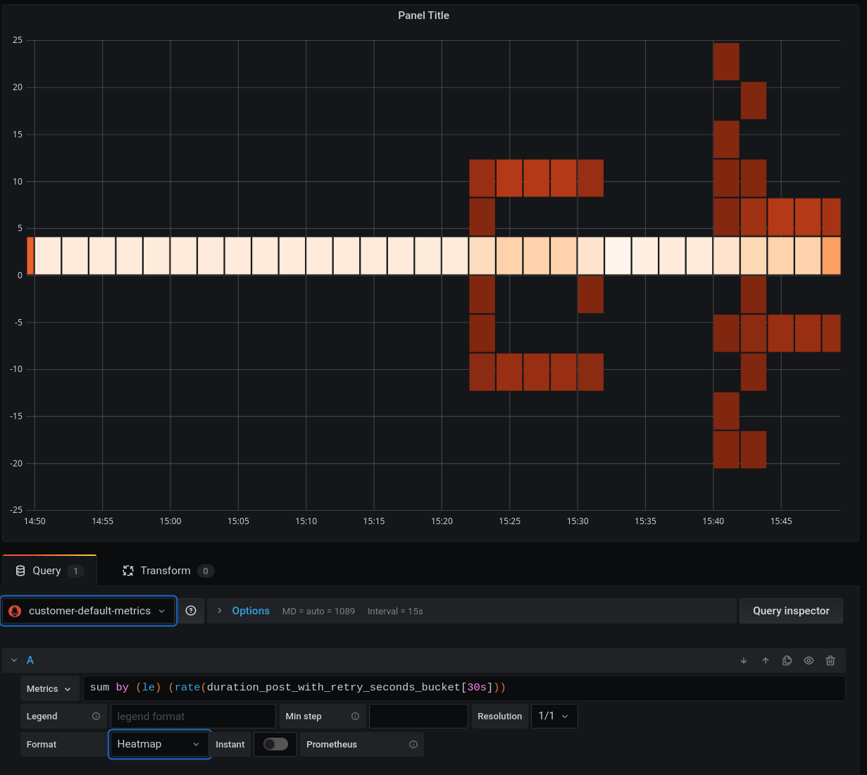
What's shown is pretty much meaningless. Don't try to understand this plot yet. There's much more to do here before this graph becomes useful! Let's get to it.
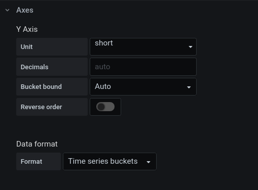
3) Set basic panel parameters
Set Format to Heatmap, and set {{le}} as the value for Legend:

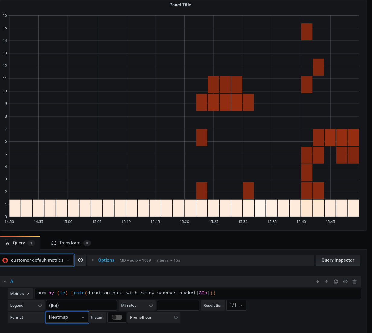
Note: type precisely {{le}} into the Legend field! This does magic; adding
more characters might create problems.
Set the data format to "Time series buckets":

That's how things look like now:

Don't look deep; still not really useful.
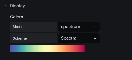
4) Set color map and hide zeros!
Set the color map spectrum to something much more useful; Spectral:

Now, hide zeros — in my opinion, this is a really important step (and this should possibly be the default):


That's how things look like now:

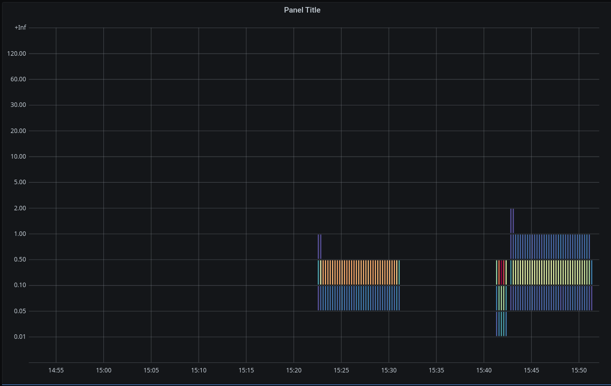
Oh! Spend some time looking at that. This just got so much more tidy. Before we hid zeros, it was really difficult to tell apart those time slices where there was is no meaningful data at all (non-existing histograms), from those other time slices where we actually do have histogram data. But what do the numbers and colors mean? We're getting closer!
4) Necessary: add a legend, units, and a title
This one here is close to my heart. A plot without units and a legend is going to be a challenge down the road. For yourself ("what did I do here?"), but also and especially for your dear readers. Take the time, and encode in the plot what this plot actually shows. This requires discipline. As a physicist, I've learned it the hard way: it's always worth investing the love and time here.
Add a legend describing the color code:


When you toggle this switch, a legend pops up in the bottom-left corner. It shows how the color spectrum maps to a number spectrum. Most importantly, you see the minimum and maximum values:

Note that the minimum and maximum values shown in the legend are for the entire time interval shown in the panel (and not for data that's not in the panel!).
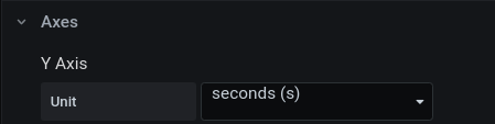
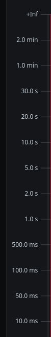
The value that is color-coded in our case here is known (a priori) to encode a duration in seconds (for knowing that you have to read/know the code that emits the metric, of course!). Set the corresponding unit:

That changes the y-axis to have useful tick labels:

Good.
Now, the plot itself still does not reveal what the color-encoded values
actually mean. The legend tells us that the right end of the color spectrum is a
dark red, and that it encodes the value 14. But what unit does it really have
and what is the exact meaning? Let's take it slow.
When you see a "dot" in the darkest red in the panel, then you can extract two additional data points:
- the time of the observation — and you know that this observation actually stems from an observation period, which is 30 seconds.
- a specific 'request processing duration' bucket (say, between 50 ms and 100 ms)
After reading out and rationalizing all three dimensions, we can try to put into words what this data point really means: you know that at said point in time, said bucket was hit with an average rate of 14 times per second, averaged across the observation period of 30 seconds.
This might sound complicated, and there are certainly many ways to put this into words, but conceptually that's what's behind every single data point shown in this panel. Help others to read this panel, by trying to build a meaningful title.
My recommendation:
- Put the notion of a duration into the title.
- Put the notion of an event rate into the title, and the corresponding unit
1/sorHz. - Ideally, also note the observation period in the title (from which the average event rate is built).
The finalized plot
Now, the panel contains essential pieces of information:

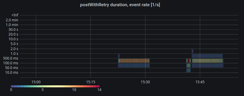
It will still take time for others to digest a plot like this. And that's fine! It's OK if you need to discuss a plot like this for a couple of minutes. With what's shown, though, this discussion hopefully becomes fun and easy.
When the plot is as tidy as this, we can begin to dig in and focus on the data interpretation.
In this specific case, what we can see is that the weight of the distribution did shift a little bit to lower durations (shortly before 15:45). Why was that? Well, raising these kinds of questions is what decent visualization of observability data should result in.
Further resources
- Blog post How to visualize Prometheus histograms in Grafana
- Grafana documentation: Introduction to histograms and heatmaps